Sainsburys Design Studio
A talk I did for Unboxed's design club on a supermarkets Design Studio

 The J Sainsbury logo, used throughout the late 20th century
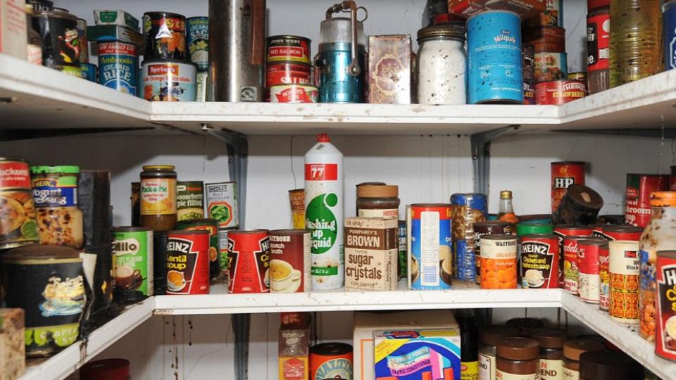
I lived with my Grandma for a while in my mid twenties. She maintained a scullery, or larder, that largely looked like this. A small room that you could stand in and be absorbed by late twentieth century packaged foods and household goods. I loved it in there. When Grandma was feeling a bit flash, she would go to Sainsburys in Trinity Street, Coventry city centre. The larder would be dotted with stacked Sainsburys goods. She had a lot of these labels stored away. Neatly folded, groovy, interesting looking, fun, and very retro, and all from one brand - J Sainsbury, Stamford Street, SE1, London.
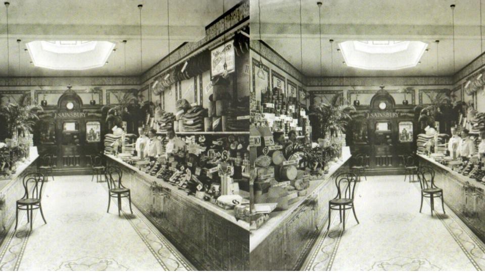
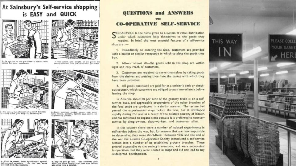
Up until the 1940s, in most grocery stores, the shopkeeper would serve customers individually, with assistants taking required items from the shelves, before they were added up at the till. Ham, cheese and bacon were sliced to order. Grocery shopping was often pleasurable, almost a social past-time.
During the Second World (1939 to 1945), this antiquated system was under strain as large numbers of women entered the workforce. With fewer staff available, the bureaucracy of rationing, and the constant threat of air raids, long queues built up.
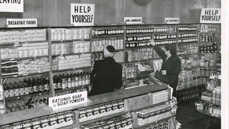 A Co-op self-service supermarket, Blackley, Manchester, 1949, with a prominent sign: ‘Help Yourself.’ Straightforward service design in action.
Clarence Saunders introduced self-service to the American public in 1916 with his first Piggly-Wiggly supermarket, allowing him to cut costs and offer lower prices. It sold pre-packaged food. By the late 1930s, other retailers had quickly copied the concept and such stores became common across the United States.
He introduced new ideas, such as baskets, price tags on products, checkouts and shopping trolleys.
Self-service was initially somewhat daunting and confusing to shoppers used to having a personal relationship with their shopkeepers. Putting groceries in a basket yourself almost felt like stealing to some.
 A guide for shoppers on how to serve yourself
In 1949, the Ministry of Food – granted 80 self-service licences, incentivising existing shops to convert to a new ‘self-service’ shopping model that would free up labour in a workforce depleted by war. Here’s how it was explained to shoppers.
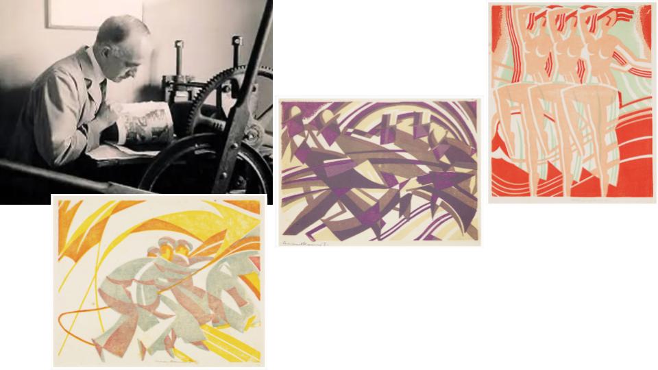 Leonard Beaumont’s linocut prints
Leonard Beaumont was a Sheffield born printmaker, graphic designer, illustrator and publisher. Beaumont was recognized for his linocut prints. (left to right, ‘Spreading Awnings’, 1932, ‘Rush Hour’, 1933,, ‘Dancing Nymphs’, 1934)
He went on to be Art Director in the Publicity Department of United Artists Film. They wanted a skilled designer who could tone down the American film posters, considered too brash and vulgar for British audiences. He was also recruited to help with propaganda posters for the Ministry of Information, the Ministry of Food and the General Post Office during the war.
After the second world War, Leonard was appointed the first design consultant for the supermarket chain Sainsburys, in 1950. His brief was to establish a uniform corporate identity, a simple design, that would reflect the company’s reputation for quality.
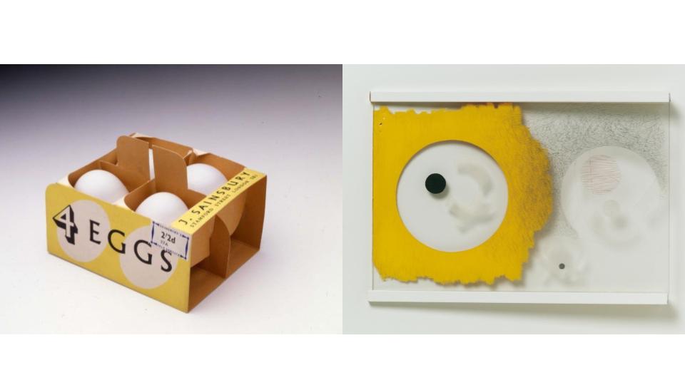 Egg carton (1950) by Leonard Beaumont
Space Modulator (1942), by László Moholy-Nagy
Egg carton (1950) by Leonard Beaumont
Space Modulator (1942), by László Moholy-Nagy
What came first was the problem of the egg. Until this point, if you wanted to buy an egg, a worker would hand-pick it from a wicker basket behind the counter and place it in a small paper bag or, if you were lucky, a rudimentary carton.
Leonard Beaumont’s problem was working out how to package these dreams. The egg box was an existing technology, but it was missing something – a carton from the 1930s simply read ‘J. Sainsbury’ and ‘Freshness Guaranteed’. Beaumont knew that it would no longer be enough to simply pack the eggs: now that the product was liberated from the care of the salesperson, they needed to be packaged.
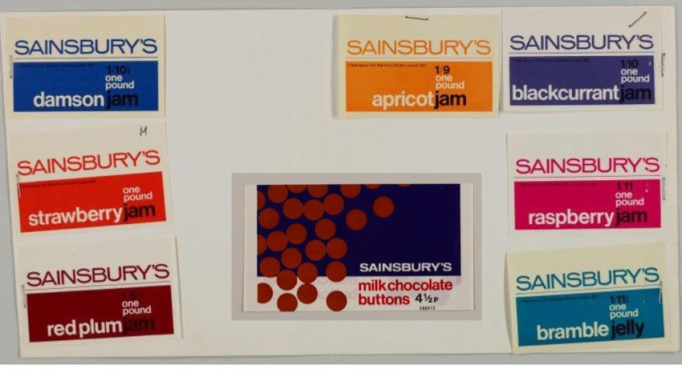
Check out these jams. Beaumont was chosen by Lord Sainsbury to head up the Sainsbury design studio. He was influenced by the simplistic but modern designs of Frank Pick, the man responsible for the London Underground “brand”.
They wanted to move away from Victorian nostalgia to a durable and pragmatic taste – a visual representation that would resonated with the then modern consumer.
By 1960, there were 1,000 Sainsbury’s own-label products, all unified with a common visual language.
Lord Sainsbury said:
our design will have failed if our customers have to read the name over our entrance to know the shop they are entering.
Here’s a great excerpt from culture blog Vittles:
Wherever a creative process is a group effort – when it stretches between people and across a number of years – one iteration of that team will always emerge as the line-up.
For Sugababes, it was Mutya, Keisha and Heidi, from 2001 to 2006. Arsenal’s ‘Invincibles’ season of 2003–2004 would come to define the club for almost twenty years. Leonard Beaumont may have set the tone for the design of Sainsbury’s own-label products, but the company’s heyday started in 1962, with the arrival of Peter Dixon and the birth of the Sainsbury’s design studio.
 the ‘Sainsbury’s’ here becomes the straw
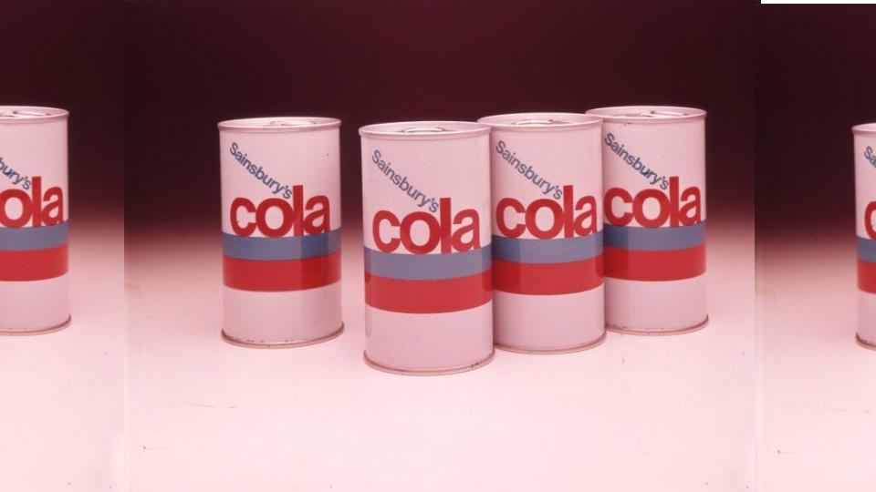
The hits came fast. Two fat horizontal stripes – the lower one in bright red, the upper in cerulean – wrap around the white belly of a cola can designed in 1966. Sat lightly on top of the blue stripe is the word ‘cola’ in red, lower-case Helvetica, its letters huddled so closely together that they touch, turning the word into a coherent form in its own right.
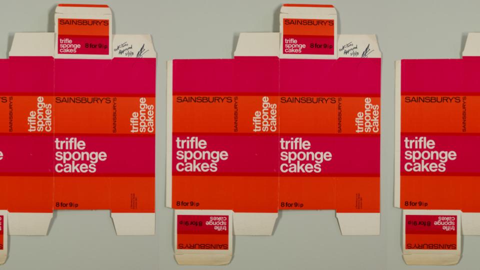 Sainsbury’s Trifle Sponge Cakes (8 for 91/2p) packaging. Labelled “out-turns, Approved 1971
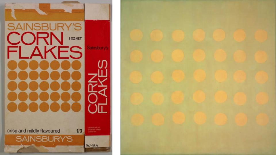 Sainsburys cornflakes, Agnes Martin’s 1959 work “Buds”
More from Vittles:
One particularly iconic design is Bill Wilson’s 1970 cornflakes box. Beneath the ‘corn flakes’ – which is huge, in slim, angular lettering – are thirty-five golden circles, arranged into a neat grid pattern. The abstraction of this particular design is almost total: it is similar to Agnes Martin’s 1959 work Buds. In many of these designs, flat, block colours dominate, a shock against a background of white: a set of 1967 jam labels look like Pantone colour swatches.
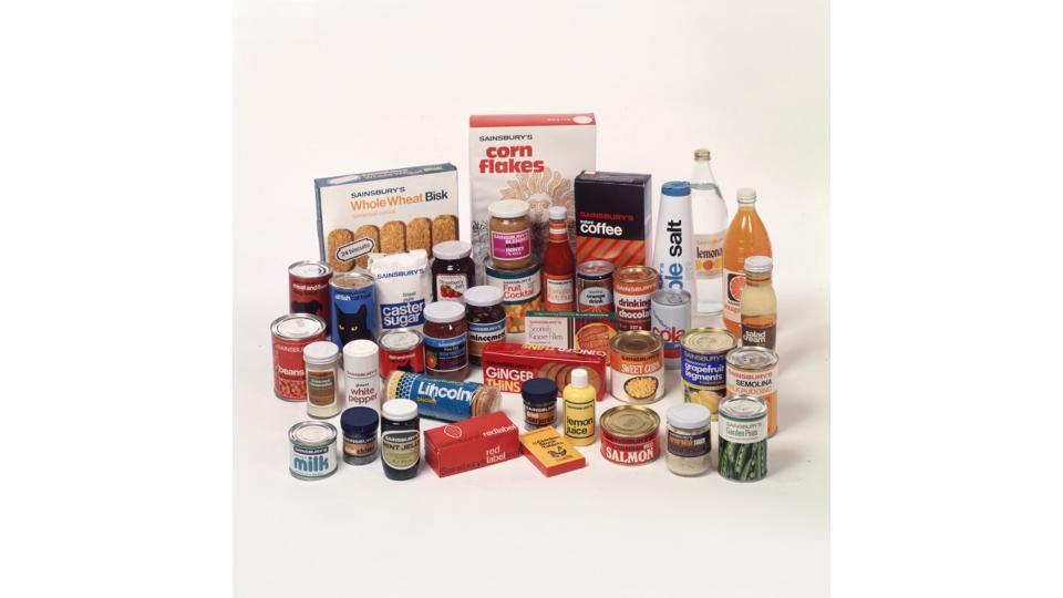 A range of goods
The packaging of goods had a striking, consistent and clean appeal. It was selling the idea of a supermarket, hygiene, and helping yourself, and it’s strong iconography helped raise Sainsburys to be the UK’s first supermarket. Looking at them now they give off huge retro-cool vibes, and it’s modern aesthetic still lingers. As a kid, staring into Grandma’s larder, I didn’t know they were retro, but I knew they were cool.
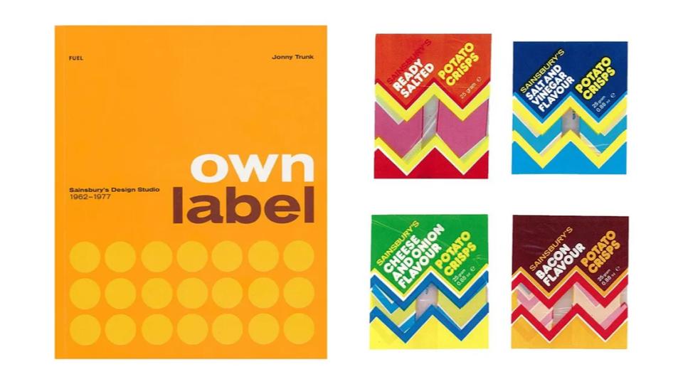 Own Label book and own brand crisps
“these revolutionary designs were a paradigm shift from what had gone before. They were optimistic, creative, and they put Sainsbury’s on the map as a brand to be reckoned with” Creative Bloq
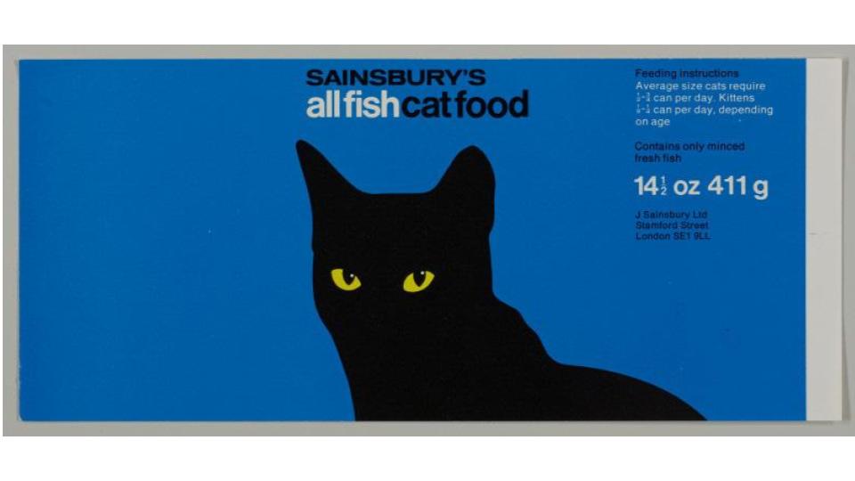 😻
😻
Stunning. Sainsbury’s All Fish Cat Food.
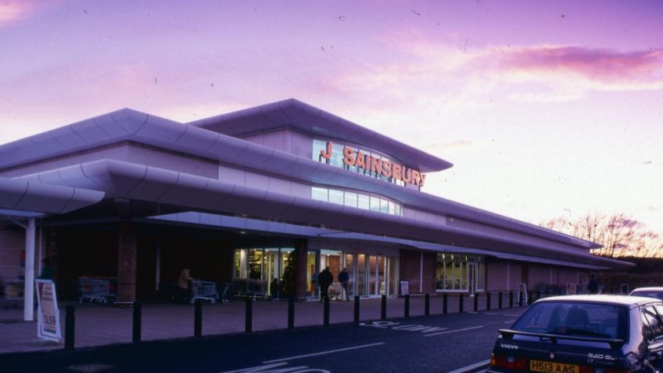 Aberdeen branch, 1988
The eighties.
This sort of big box off high street supermarket was popping up all over the UK. Supermarkets could get planning permission, huge car parks could surround them, and importantly doing a ‘big shop’ meant consumers spend more in a visit. The big chains could also offer a bigger range. Half of households now owned a car, and this style of retail park was on it’s way to being the norm. Town and city planners continued to let the private car dominate decision making, and the high street, and market square, and the community benefits that were intrisically linked with them, were on the way out.
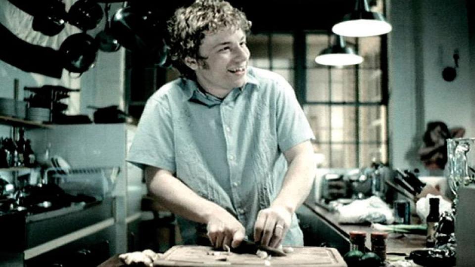
June 2000: Sainsbury’s signs Jamie Oliver to front new TV advertising after the account moved back to advertising agency ‘Abbott Mead Vickers’ from ‘M&C Saatchi’. The high street continued to dwindle, and IMO Sainsburys packaging has looked dull ever since.
There’s a great website with all of this on, and the Sainsbury Archive occupies a small section of the Museum of london at their docklands place. The book ‘Own Label: Sainsburys Design Studio’ is also a great monument to the studio.